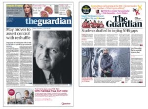
It may well be that a spike in The Guardian’s circulation figures over the last few weeks will be down to graphic designers across the land analysing its new look.
The paper has gone from the award-winning Berliner format to a tabloid incarnation, with its online and app versions being given an early spring-clean too.

A big redesign is big news for those who love to experiment with typefaces and colourways. So it’s no surprise the change sparked a bit of chatter in the media world.
It is also a sign of the times.
Media brands need to reinvent and innovate if they are to remain relevant in 2018. And keeping things fresh is as important in the membership-publishing arena as it is for the newsstands.
At any one time, our team of designers, editors and thinkers are analysing a title to see how it functions for the individuals who’ll receive it.
Perhaps an organisation is going through a rebrand; in which case, its member communications will need not only to reflect that new identity – but extend it from a set of guidelines into a language, look and feel that allows members to feel part of a dynamic community.
Or perhaps we’ve been working with a particular client for some time, and we’ve got to know them, their passions, priorities and preferences. We’ll have conducted reader surveys too, that give us pointers on how to evolve. We analyse the ways in which members use the communications we produce – how long they spend on them, which parts they are drawn to, and what they do once they’ve finished reading. All this vital information gives us the grounds to re-approach a project with confidence, in order to ensure what we make remains essential to the community it’s targeting.
A case in point is the Royal Photographic Society’s Journal. We revamped the title entirely when we began working with the society in 2014, generating happy readers and a clutch of industry awards. Come 2018 it was time to refresh. We needed to keep our readers interested, whilst maintaining the Journal’s position as a key member benefit.
Just as with newsstand titles, membership content should grab the attention. Its job is to retain and attract members – so keeping audiences engaged by what lands on the doorstep, in their inbox or on their screens is a must. And it’s not just about choosing some whizzy new fonts. The tone of voice our writers use, the brief we give our photographers – everything down to the final square millimetre of a glimpse of white space on the page – is considered.
We like a great redesign. And we love it when it works for you.
In short
- The Guardian’s new look has put publication design on the agenda
- Member communications must stay fresh to keep your people engaged
- We’re always looking for ways to improve


