Why we shouldn’t put down pop-ups

Mention pop-ups and you might think of those insidious ads hidden away in websites waiting to jump out on an unsuspecting visitor in order to promote garden furniture or the latest revolution in toothbrush design. But are they really so bad? And, built correctly, can they be the first step on a membership journey?

Pop-ups may have a bad press but everyone can think of examples where a website has given the option to sign up to a newsletter or a promotion that they have taken advantage of. Maybe it’s time to reassess the pop-up and its use in acquisition marketing.

Research from SumoMe analysing 1.7 million pop-ups showed an average conversion rate of 3% across the board but that rose to 9% for the top 10% of performers. That means a site with, for example, 50,000 unique visitors per month could see 1,500 to 4,500 conversions each month. If a pop-up’s call to action is sign up to an email newsletter, you can see how that list will start growing substantially with minimal effort beyond the original set-up.

So, what makes a good pop-up?

Relevance
The pop-ups that make sense within the context of the customer journey are the ones that perform best – signing up to a newsletter that relates to the subject matter the user is reading about, the option to download a report that relates to an article, some offline resources that lead on from the subject matter on screen at the time.

Timing
Timing is one of the key aspects of a good pop-up. The highest-converting pop-ups don’t appear immediately – they wait until the user has gained a benefit from the site. If a pop-up materialises on entering a site it gets in the way of the user experience and reduces engagement.

To determine the perfect time to trigger your pop-up, you need to look at the average time spent on site. Research shows that setting the timing to 60% of the average time spent on site can be effective, but the ideal time will differ for each audience. Trial and test to find the ideal time for your audience.

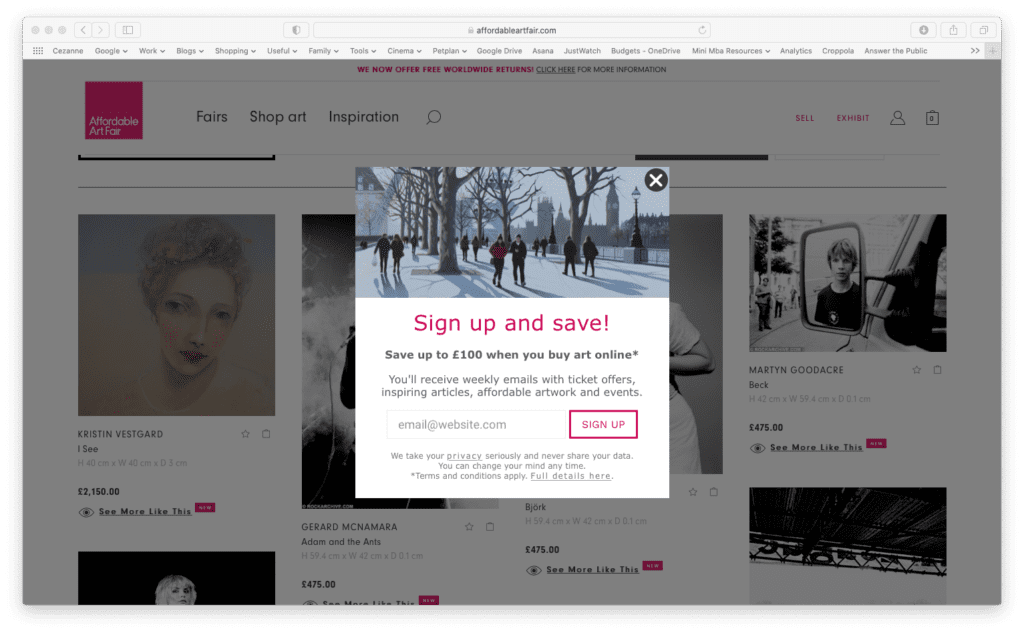
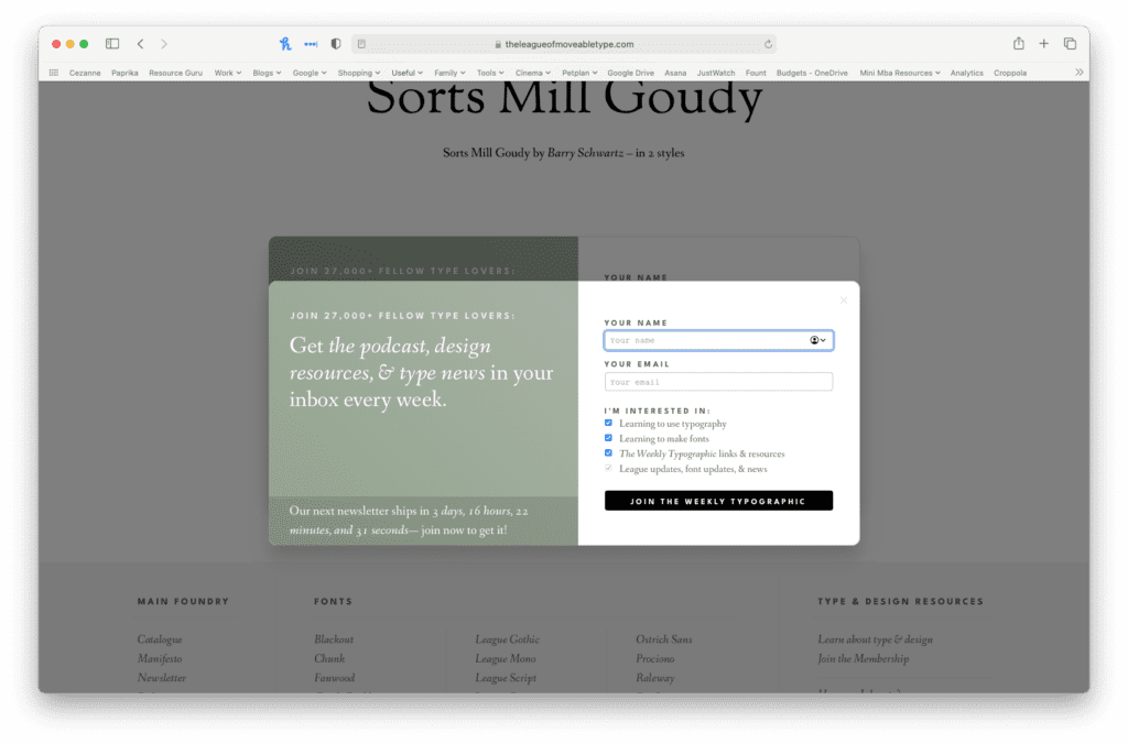
Clear benefits and actions
You have less than a second to make your pitch with a pop-up, so keep it simple. Make your call to action and the benefits of action clear, concise and engaging. Offer value, rather than asking people to sign up to a newsletter for “all the latest news and offers”. Spend time shaping your copy to make it relevant, authentic and irresistible.

Personality
Use design and imagery to add personality to your pop-up. Pull through the personality and tone of voice from your site to make the pop-up feel less like an exercise in data capture.

Value
The best performing pop-ups offer value. Downloadable reports, weekly updates, exclusive information, early access – all of these and more can be used to add value to your proposition.

Five examples of creative pop-ups

Digiday
This pop-up makes its benefits clear and asks for simple information. The use of ‘I’m not interested’ instead of an exit icon requires the reader to think again about signing up

Affordable art fair
A clear financial benefit with clear privacy signalling.

Bookshop.org
Bookshop.org seeks to push users towards local bookshops rather than Amazon. The site encourages sign-up by highlighting the reason that people visit the site (love of books) and promotes a sense of community.

Nature TTL
A super clear benefit proposition, this pop-up tells readers that they will help them take better photos and offers a free eBook which leads through to list sign-up.

The League of Movable Type
A clear explanation of what the user will receive married with top-level audience segmentation.

Looking for industry insights, growth strategies and award-winning content?

Sign up to our newsletter

close-link